PERT Charts
A PERT chart is a project management tool used to schedule, organize, and coordinate tasks within a project. PERT stands for Program Evaluation Review Technique.
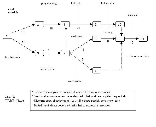
A PERT chart presents a graphic illustration of a project as a network diagram consisting of numbered nodes (either circles or rectangles) representing events, or milestones in the project linked by labelled vectors (directional lines) representing tasks in the project. The direction of the arrows on the lines indicates the sequence of tasks.
An example of a PERT Chart is shown below:

Difference between PERT, GANTT and CPM
Both PERT and Gantt charts will display the tasks to be completed, but the charts emphasize different pieces. In Gantt charts, the focus is on the percentage completion of each task, without demonstrating the link that two tasks may have to each other. Where as a PERT chart will show the links. CPM is cost based where as PERT is time based. The primary point that distinguishes PERT from CPM is that the former gives the extreme importance of time, i.e. if the time is minimised, consequently the cost will also be reduced. However, cost optimisation is the basic element, in the latter.
GANTT:
